tox needs a logo #639
Comments
|
I like when a logo is not only made of the letters of the product. The flute / road-sign / jack-in-a-box could be really nice, and you could have versions of the logo with and without Tox written below/aside. Also, looking at the PDF, the 7th logo made me think about a beetle (don't know if you guys can put a meaning on that) or a turtle, and the 16th could look like a nail targetting a cross, helped by the circle if it was more encircling the T. The last one is too much like controllers buttons. |
|
I think you can draw a snake (python) head with the letters though, but it will need more talent than I got:
✌️ |

|
I'm not sure we'll get availability for these; so maybe we should just go ahead with one of the ones we already have ready (sent out to the mailing list in round 2). |
|
@hpk42 is in touch with Gero who could do some more design work. When I am back from London I wanted to see if we can get anywhere with this. |
|
Please make it look decent on favicon size, that's my top concern, I hate complex logos. Also if you make it use a single color it will be cheaper to make nice transparent sticker for our laptops. Also avoid doing the kind of work Atlassian and JetBrains did with their re-branding ;) |
|
Hello! I came across this issue and wanted to contribute. Here are some prototypes. PTAL |


|
Love the 5th, 6th and 8th! But all are good anyway 😄 |
|
i like the first one and the last one |
|
I would accept the first one 👍 @hazalozturk nicely done; those colors I think could work nicely with re-branding our webpage too 👍 |
|
I like the 1st and 6th. 😁 Thanks @hazalozturk! |
|
Thanks! |
|
@hazalozturk we have at the moment https://tox.readthedocs.io/en/latest/, but I think would be nice to move something similar to https://docs.pytest.org/en/latest/, naturally with our own colours and content; at least what I was thinking of 👍 |
|
@hazalozturk created a PR for this already, however as most people were happy with option 1, I recommend let's give a try with that. We can come back later on if required. |
|
@hazalozturk do you have that it in SVG, and the raw format? thanks! 👍 |
|
@gaborbernat I just added the news fragment. Here is the svg file. |
|
@hazalozturk please commit the svg file to the repo as well in addition i think its only fair if we spin you a more prominent reference/thank you, |
|
I think that the option 1 use is likely to raise some question regarding use of male genre symbol (mars). I doubt we want to open this pandora box and send a wrong message. See https://en.wikipedia.org/wiki/Gender_symbol Here is my first attempt: |

|
@ssbarnea thansk for the words of caution, but i don't think that will be a huge issue, my understanding is, that the direction is relevant |
|
@RonnyPfannschmidt I have committed the svg file to the repo 👍 In terms of reference, whichever is more convenient for you, is OK with me. This is my very first time contributing to an open source project so I leave it to your judgement 😁 |
|
Don't mean to bikeshed but the (chosen?) logo seems a little too close to "♂" EDIT: if I read up I see @ssbarnea has the same concerns 😆 |
|
FWIW i like several of @hazalozturk 's logo drafts, except the one with the arrow. |
|
I also have the same problems with suggestion 1. My favorite from the current suggestions is 5. @hazalozturk and other potential designers who want to supply some more suggestions. Gero sent us the indesign files for his suggestions if you want to work on them. |
|
also: if the logo contains the name (which it does not have to): tox is written all lowercase, so the logo should reflect that. |
|
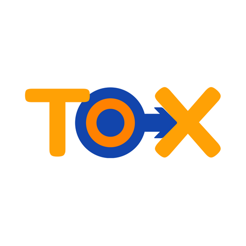
So the currently merged logo in the WIP docs is this: To get another perspective I just showed it to my wife (without telling her anything about it first) asking her to give mer her immediate gut reaction. She looked at it and immediately said: "This looks very sexual to me. It looks like the male symbol is penetrating that X" ... My suggestion for 2.10 (if we did not find a solution until then) would be that we first use a purely typographical logo and then improve on it/change it with later releases. @hazalozturk do you think you can find some time to work on finding a solution with us? |
|
Fair enough, maybe one where we use all lowercase letters 😎 |
|
@gaborbernat all lower case is another thing - true. FWIW I really like the idea of @ssbarnea as well (but that should be all lowercase :)). |
|
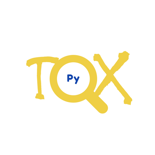
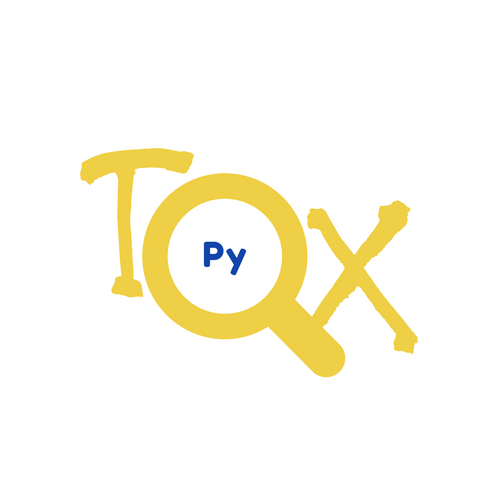
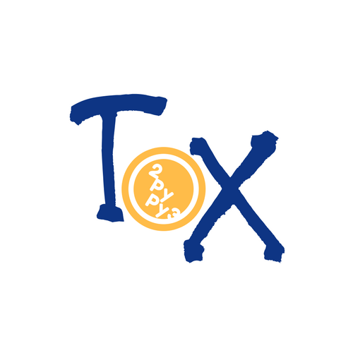
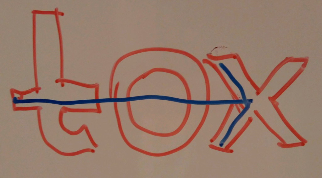
Hi guys. First thing first: I like tox as a tool and it will work for me very well regardless of the logo. Second thing: I am fine with the logo currently present in the WIP docs. Clean, working for me. Anyway, as there is ongoing discussion about what it resembles, I did my short brainstorming about what concepts the logo could use. arrow-lettersSay "tox" to be clear about product name, show arrow to express we are target to reaching x. farthing-bycicle-letterstox is a vehicle allowing to go/run. letters t-o-x embeded. farthing-bycicle-multiTox is a vehicle allowing to run tests on multiple python interpreters. This is my favourite one. interwinded-lettersFocusing through O to target X and going there using tests T. The Target is not easy to reach, but is partially getting out. |


|
I used all lowercase and colors derived from python's logo. I used 4 different fonts, let me know if you like any of them. |


|
I fancy the second one 👍 would gladly go with that! |
|
@obestwalter and @gaborbernat if second one is the final decision, I can go ahead and create another PR replacing the old one? |
|
@hazalozturk I find it a definite improvement, so let's go ahead I would say. Please provide png, svg and fav-icon version of it 👍 if it's possible. Thank you very much! |
|
Thanks @hazalozturk! |
|
Well, we have a logo now and nothing terrible happened for a while, so I guess we can close this. |
@hpk42 got the ball rolling last year and it is time that we bring this to a conclusion, so that we can get rid if that silly generic logo for our org :)
I link to the relevant discussions on the mailing list and invite everyone interested in this to join into the discussion on the mailing list.
Jad Sarout created some drafts and allowed us to build on them if we like, he has no time anymore to follow up on it himself. The discussion is here.
Here are his drafts:
Thank you Jad!
Discussion round 2 is here. The drafts are by Gero (sorry do not have his full name yet) and are in this PDF: tox-2017-06-01.pdf (note: the writing would need to be adapted to spelling tox all lowercase).
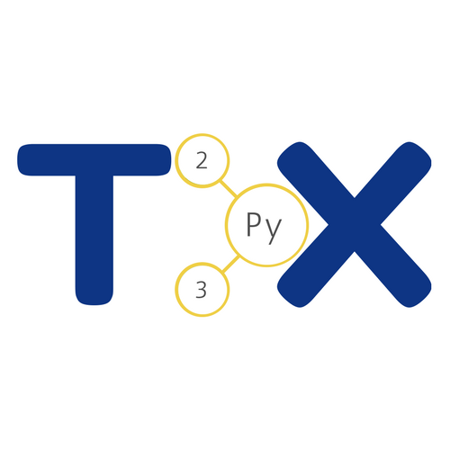
I also have an idea for a logo that is based on transpiling the flute from the pytest logo - for reference:
And here is my horrible sketch. If someone who is into graphics (Gero?) would want to create something concrete from that I'd be thrilled :)
I also really liked the idea from Laura Creighton about that Jack in a box, but there is no draft for this:
[relevant context]: tox is short for "testing out of the box" :)
The text was updated successfully, but these errors were encountered: