Chat UI Library
Chat UI Library is the underlying infrastructure that can create interfaces in the chat box.
The API and component model are inspired by JavaFX and Swing.
The PlayerChatView interface represents the high-level view of the chat box. It handles incoming messages and rendering of the final output. Refer to the documentation on the interface for information on its methods.
To obtain the PlayerChatView instance of a player, call ChatUILib.getView(...). The method has overloads for UUID, Player and CommandSource.
If a plugin wishes to implement their own PlayerChatView, they need to listen for the event: CreatePlayerViewEvent.
This event is fired when a PlayerChatView is about to be assigned to a player. The method getView() can be used to get the new view instance, and setView() will change it for that player.
This event is probably only relevant for plugins that implement their own PlayerChatView. It is fired whenever a player changes their config (e.g. with the /chatui config command).
This event should be used to update the player's top-level PlayerContext.
To relate to JavaFX, if PlayerChatView is the Stage then TopWindow is the Scene.
The top window is the principal view that a player sees and interacts with. A basic PlayerChatView will simply delegate to the top window.
The top window can be shown and removed by calling showWindow() or removeShownWindow() on a PlayerChatView.
If no window is shown (getWindow() returns null) then the chat box behaves identically to not having Chat UI Library installed.
By showing a top window, it acts like an "overlay" - the normal chat is buffered underneath until the window is removed.
Note that the behaviour is dependent on the implementation of the PlayerChatView, in the case of Chat UI's tabbed window interface, top windows are added as a tab.
Also be aware that getWindow() might not return the same TopWindow object that was given in showWindow().
The top window receives text input from the player, as well as internal /chatui commands. The top window must render the entire display when draw() is called.
An example TopWindow is the TextEditorWindow.
The player context is an important concept. It defines the bounds to draw text, as well as provides font information.
The context should be taken as being the "true" parameters to draw text. The top window receives a PlayerContext where the width/height it whatever the player has configured (by /chatui config).
If you only use existing components from the component API, you shouldn't need to handle the context directly. But if you create custom components, it is required to draw according to the context.
As an example, say you want to create a component that contains two child components: top and bottom. The two components should receive a context where the height has been halved (ctx.withHeight(ctx.height / 2)).
The child components must draw only within the given bounds in order for the parent to glue them together to fit within its own bounds.
The utils() method on PlayerContext provides an instance of TextUtils configured with the player's font data.
TextUtils provides many useful methods for manipulating and building Text objects.
The fundamental drawable unit is an instance of ITextDrawable.
A "text drawable" is simply an object capable of creating a Text object that respects the given PlayerContext.
Most of the time UIComponent is used instead. The idea is similar to JavaFX's Node.
Components have 3 basic properties - minimum width/height, preferred width/height and maximum width/height.
By default these are all set to the bounds from the PlayerContext.
The one method required to be implemented is void draw(PlayerContext ctx, LineFactory lineFactory)
This is similar to the draw() method of ITextDrawable except lines of text are appended to the LineFactory, and blank lines to fill any remaining height is not needed.
A UIPane is an abstract class capable of rendering multiple child components. UIPane is itself a component - making nested panes possible.
The exact nature of how a UIPane lays out its children depends on what type of pane it is.
A simple pane that lays out its children vertically in the order they were added.
It attempts to draw all children with their preferred height. If not all children will fit, it will attempt to draw children according to their minimum height, any remaining children that cannot fit are not drawn.
Similar to VBoxUI, except lays out children horizontally. Preferred width is attempted, but falls back to minimum width if not all children will fit.
Supports anchoring children to a specific side (top, right, bottom, left). Only top and bottom are currently implemented.
Use addWithConstraint() to add a child with an anchor. Child components not given constraints are simply appended to the middle section (i.e. not on a side) vertically. It is recommended to have just one unconstrained component (e.g. A VboxUI) to have more control over the layout of the middle section.
Child components are stacked next to each other, if they don't fit then they will "flow" according to the wrap mode.
If the wrap mode is WRAP_HORIZONALLY then components are drawn horizontally as with HBoxUI, but if they don't fit then it will wrap onto a layer below. Conversely WRAP_VERTICALLY will stack components vertically until they don't fit, then start a new column.
This is internally implemented by creating nested VBoxUIs and HBoxUIs.
A component that draws a label surrounded by a border. click handler can be given by setClickHandler(). It will be called whenever the player clicks on the label.
truncateOverflow() controls whether to squash the label and append "..." if the button would not fit in the context.
The Table Model API is similar to Swing's TableModel.
TableUI is the UI component that pairs a TableModel to a
TableRenderer.
The first step to creating a table is to implement the TableModel interface. It is a simple self-explanatory interface. The Object returned by getCellValue is passed directly to the
TableColumnRenderer - the default implementation simply calls Text.of() on the value.
To render the table you will need a TableRenderer. The DefaultTableRenderer is a good choice for most use-cases, and can easily be extended. To have no borders on the table, use BorderlessTableRenderer.
A table renderer has three main functions: create a viewport, draw borders, and create TableColumnRenderer instances.
A TableViewport returns the starting row and column to render. This can be used to implement scrolling.
A useful helper is TableScrollHelper. It creates a viewport and provides functions to scroll the table up and down.
TableColumnRenderer simply handles rendering cells of a particular column. It may be desirable to render different columns using different column renderers. E.g in Chat UI, the config editor has
a different renderer for keys and values in a key-value table.
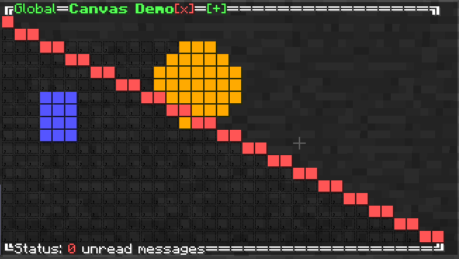
The CanvasUI provides a grid-based drawing area. There are two "contexts" for canvases: Context.BLOCKS and Context.BRAILLE.
The block context uses the U+2588 "Full block" character. The block character has the same height and width, making it ideal for square pixels.
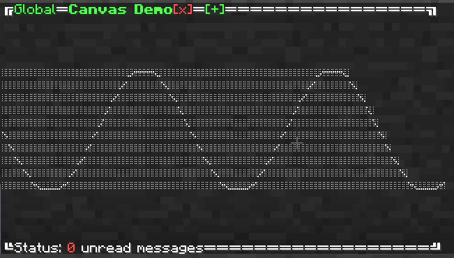
The braille context uses the Braille Patterns unicode block. Due to there being 8 sub-pixels per character, many more pixels can be packed into the same area. The main disadvantages are that it pixels are not individually colourable and it is not as clear as the block character.
Use the getContext() method to create a rendering context for the canvas e.g. BlockRenderContext ctx = canvas.getContext(Context.BLOCKS);. Once a context has been obtained it cannot be changed.
The two rendering contexts, BlockRenderContext and BrailleRenderContext, have similar methods. The main difference being TextColor for coloring in block context verses boolean for set/unset pixel value in braille context.
The abstract base class RenderingContext provides a method addLayer(). The Layer interface can be used to implement custom drawing. As the name implies, shapes can be layered, so overlapping shapes is possible.
To implement custom layers, refer to the methods on LineDrawingContext.
Example of block rendering:
Example of braille rendering:
Chat UI Library comes with a text editor: TextEditorWindow.
It is implemented as a TopWindow due to needing control of text input.
The getLines() method returns the lines in the editor. This list is mutable so lines can be set externally.
Here is what it looks like:
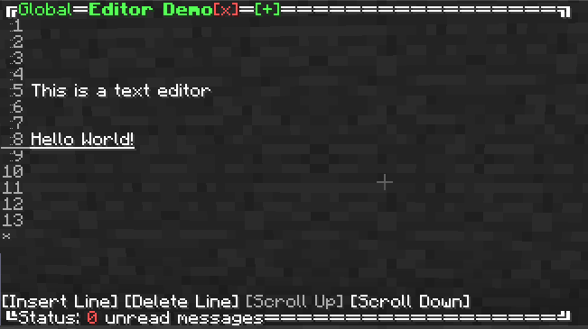
Append new lines to the end of the editor with the * button in the margin. Clicking on a line will select that line as the active line. Clicking again puts the content into the chat text area. Set the content on that line by entering it in the chat. Buttons are provided for inserting and deleting lines at the currently selected line.
The line factory class is used by UIComponents for outputting their content. Each line of text must be added to the factory, and no Text object should contain a newline character.
The main advantage of the line factory is MergingLineFactory. This subclass can horizontally merge lines together e.g. "A1\nA2" and "B1\nB2" merge to become A1B1\nA2B2. This is how HBoxUI works.
Contains common utilities.
Functions for creating and measuring text objects. Instances are obtained from the PlayerContext. A useful method is splitLines() which can split an arbitrary Text object into lines limited to a given length in pixels.
Keeps track of the total pixel width of each text object added to the buffer.
A CommandSource implementing ProxySource. Forwards calls to an underlying CommandSource. Create a subclass to override behaviour of any method, just like with Guava's ForwardingList